Here’s an interesting story that I discovered and want to share with you about the meaning of colours.
There was Mary in a white box. Mary is a scientist and her expertise is about colours, she knows everything on this subject: the vibration, the wave length, the effects on the brain; almost all the properties of a colour – but she lives in a white box.
That’s where she was born and grew up. She can only observe the outside world on a black screen. Then one day, someone opened the door and Mary came out.
And here’s what she sees. She sees a blue sky. At that very moment, she discovered something that all her studies wouldn’t have been able to teach her: she learn what we FEEL when we see a colour.
Each colour has the power to evoke an emotion so when choosing and combining colours in the right way for your brand, you will have a great visual tool to tell your story.
To help you create the perfect mood for your projects and branding, you can find all of my colour palettes on my Pinterest board HERE
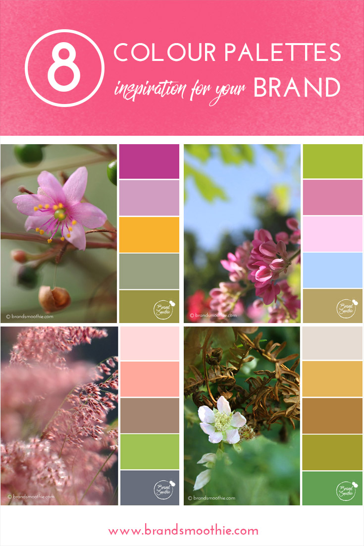
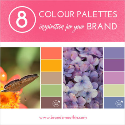
BE INSPIRED BY THE FOLLOWING 8 COLOUR PALETTES:
* © Colour Palettes Brand Smoothie. | All photos are from Stephanie Manuel Photography
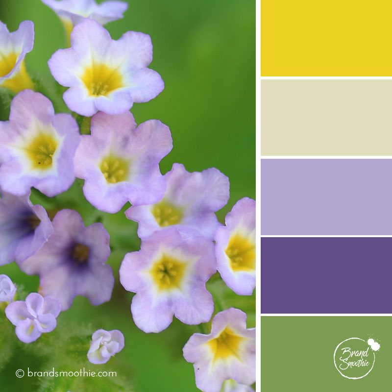
{Delicate Purple}
has that airy feel of fresh spring days.
Colour keywords: fresh, delicate, joyous

{Dry Leaf}
reflects earthy tones.
Colour palette keywords: grounded, natural, chic
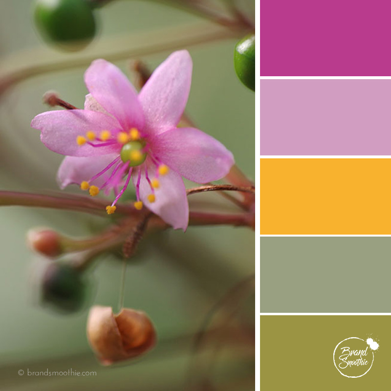
{Tropical Femininity}
is an invitation to a sunny and feminine tropical exploration.
Colour palette keywords: punchy, discovery, charming

{Golden Leaves}
shows the beautiful colour evolution of leaves from green to brown.
Colour palette keywords: authentic, relaxing, reliable.
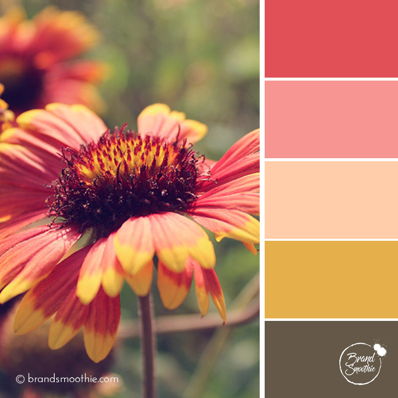
{Red Summer}
combines a caring energy with the combination of golden brown and red.
Colour palette keywords: caring, glow, warmth.

{Tropical Sky}
funny enough looks like the comforting colour combination in the 70’s.
Colour palette keywords: trustworthy, comforting, creative.

{Summer Pastel}
offers a really cheerful yet subtle vibe.
Colour palette keywords: cocooning, indulgence, pleasure.




Leave a Reply